Emily Blincoe
Personal Background
Emily Blincoe was born and raised in Austin, Texas. She is in her early 40s, but first started photography when she was 22 after her brother bought her a film camera and tried to teach her how to use it. She didn't end up getting super into photography until a few years later, when she got a point-and-shoot camera for herself. She is a self-taught photographer and started by just taking pictures of events and places as a way to preserve memories, but slowly started using photography as a creative outlet. When Instagram came out she started posting her pictures there and gained a following. In 2013 she left her job to do photography full-time and signed to an agency. She now works back and forth between Nashville, Tennessee, and Austin, Texas. She also spends a lot of time traveling to take pictures.
Emily Blincoe was born and raised in Austin, Texas. She is in her early 40s, but first started photography when she was 22 after her brother bought her a film camera and tried to teach her how to use it. She didn't end up getting super into photography until a few years later, when she got a point-and-shoot camera for herself. She is a self-taught photographer and started by just taking pictures of events and places as a way to preserve memories, but slowly started using photography as a creative outlet. When Instagram came out she started posting her pictures there and gained a following. In 2013 she left her job to do photography full-time and signed to an agency. She now works back and forth between Nashville, Tennessee, and Austin, Texas. She also spends a lot of time traveling to take pictures.
Style
In her work, she utilizes repetition, color, texture, and form to create arrangements of different objects that are very satisfying to look at. She will arrange objects such as fruit, candy, packaging, rocks, leaves, and more into squares or other shapes, often times organized by color. The arrangements are often placed against solid, colorful backgrounds, adding another element of color to her works. This also adds contrast to her images since the background is smooth and a lot of the objects she uses in her pictures have different textures. She has said that color has always inspired her, in things like nature, fabric, or food, so she tries to incorporate those elements into her pictures.
In her work, she utilizes repetition, color, texture, and form to create arrangements of different objects that are very satisfying to look at. She will arrange objects such as fruit, candy, packaging, rocks, leaves, and more into squares or other shapes, often times organized by color. The arrangements are often placed against solid, colorful backgrounds, adding another element of color to her works. This also adds contrast to her images since the background is smooth and a lot of the objects she uses in her pictures have different textures. She has said that color has always inspired her, in things like nature, fabric, or food, so she tries to incorporate those elements into her pictures.
Philosophy
The idea for Emily's most popular series, "Arrangements," was discovered on accident. She had been messing around with different ideas for object photography and arranged some green and red objects in a grid and took some pictures. A few years later she tried this idea again, shooting the pictures in six different parts. She then moved on to doing this type of photography with food, then with candy, then with a wide variety of different objects. Now, she says that she tries to tell stories with her arrangements and lets the ideas come naturally to her. She says that she knows that this genre of photography has been "over saturated" but that she does not care. She creates her art for herself and not other people, so the idea of people thinking something is "played out" doesn't bother her.
The idea for Emily's most popular series, "Arrangements," was discovered on accident. She had been messing around with different ideas for object photography and arranged some green and red objects in a grid and took some pictures. A few years later she tried this idea again, shooting the pictures in six different parts. She then moved on to doing this type of photography with food, then with candy, then with a wide variety of different objects. Now, she says that she tries to tell stories with her arrangements and lets the ideas come naturally to her. She says that she knows that this genre of photography has been "over saturated" but that she does not care. She creates her art for herself and not other people, so the idea of people thinking something is "played out" doesn't bother her.
Influences
Emily has stated that she has a lot of different influences, and that it is hard for her to answer this question without putting herself in a box. She says that her influences are "ever-changing and evolving" and that she looks for new sources of inspiration daily. However, she does have some constants when it comes to influence. She has always been inspired by colors, both in nature and in all kinds of different objects, especially in her "Arrangements" series. Faces are another big source of inspiration for Emily. She says that faces are important and worthy of documentation, and that photographing them creates a lasting time-capsule to look back at. Her biggest influence, however, is just creating images for herself that she enjoys creating. She says that it can be easy to get wrapped up in creating whatever people want you to create, but that she feels the most satisfied when she is creating for herself.
Emily has stated that she has a lot of different influences, and that it is hard for her to answer this question without putting herself in a box. She says that her influences are "ever-changing and evolving" and that she looks for new sources of inspiration daily. However, she does have some constants when it comes to influence. She has always been inspired by colors, both in nature and in all kinds of different objects, especially in her "Arrangements" series. Faces are another big source of inspiration for Emily. She says that faces are important and worthy of documentation, and that photographing them creates a lasting time-capsule to look back at. Her biggest influence, however, is just creating images for herself that she enjoys creating. She says that it can be easy to get wrapped up in creating whatever people want you to create, but that she feels the most satisfied when she is creating for herself.
Compare and Contrast
|
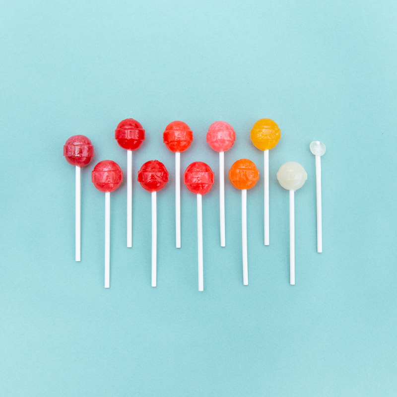
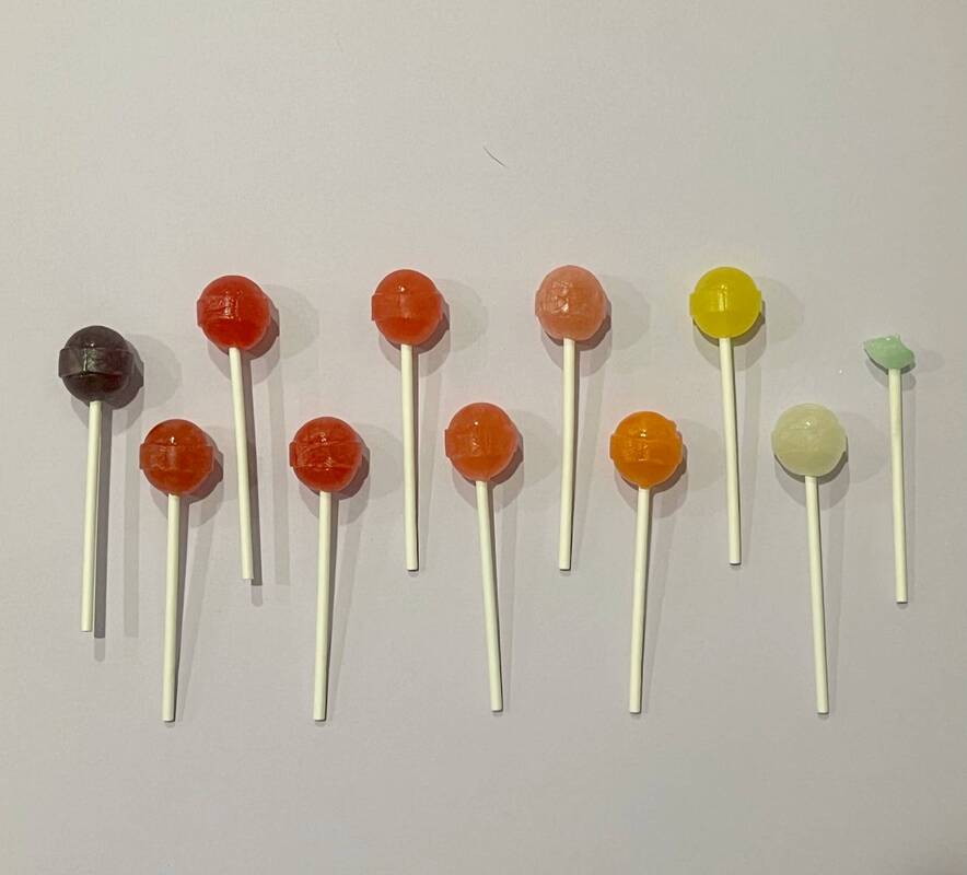
Untitled Lollipops in Color Order (Blincoe)
|
Lollipop Rainbow
|
This picture was somewhat challenging to take, mainly because the package of lollipops I had didn't have two white ones, so I had to improvise by using a green one, but I figured it would work with the order of colors and I ended up really liking how it turned out. I was also having troubles with this one with the shadows, both of the lollipops and of me taking the picture, which I successfully cropped out. I also noticed that my picture is not as vibrant as hers, most likely because she has access to professional equipment, while I just did mine in the kitchen. I also used a lavender background for this picture instead of blue like she used because I could not find a blue piece of paper, but I really liked how the purple looked. Despite the differences between her picture and mine and the struggles I had while taking it, I still really like the way my picture turned out and I think I did a good job recreating it to the best of my ability with the resources I had.
|
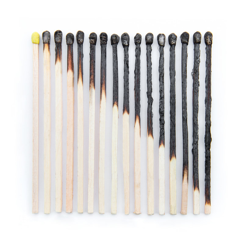
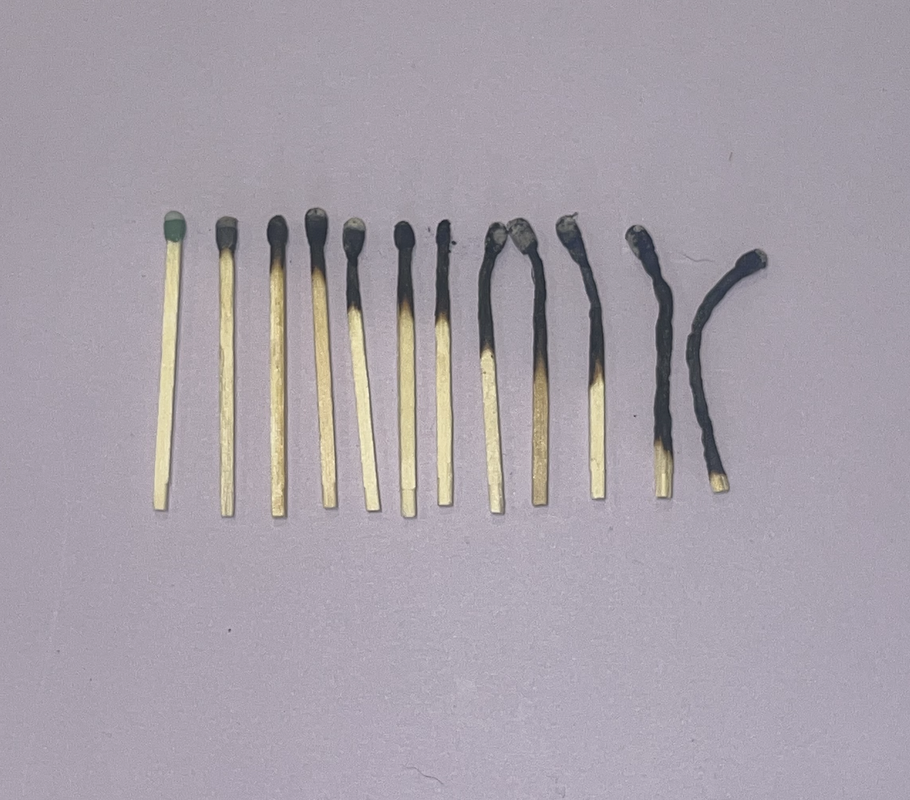
Untitled Matches Becoming Increasingly Burnt (Blincoe)
|
Matchsticks
|
This picture was definitely the most difficult to recreate of the three I chose. My matches seemed to be a lot more flimsy than hers and kept bending after I lit them. I also had a lot of problems with the matches breaking after I blew out the flame because they became more delicate. It was also a struggle to get them to burn to the right spot on the match, and I had to figure out a way to not get burnt for the ones where the flame goes further down. In total I used almost an entire box of matches to make this picture. Her matches were also longer than mine and were all the same length, whereas mine were pretty short and had varying lengths which gave me trouble when I tried to line them up for the actual picture. I also decided to take this picture on a piece of purple paper because with the lighting I had available it looked better than it did on a white background.
|
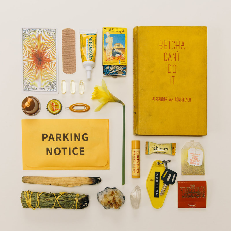
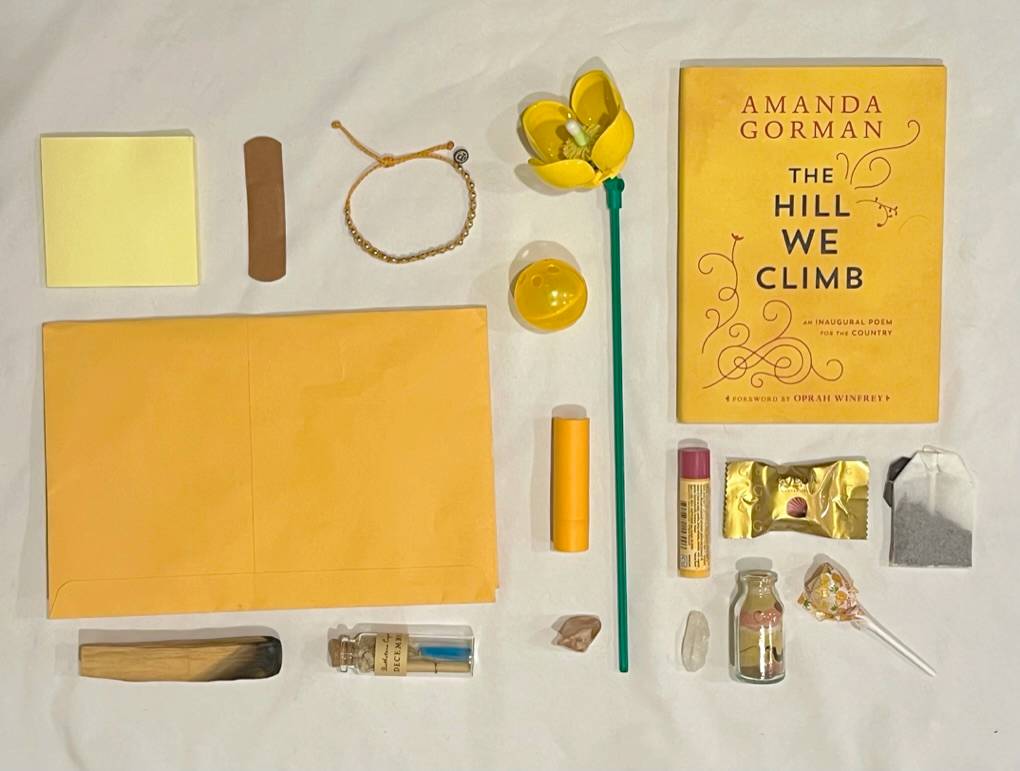
Untitled Yellow Objects (Blincoe)
|
Yellow Arrangement
|
This was my favorite image to take out of all of them and it was the one that gave me the least trouble. I had a lot of similar items to the ones she used in her picture, but I did have to improvise with some of the items that I didn't have. I used a white pillowcase for the background because I didn't have any other plain white background in my house that was big enough. This caused there to be some wrinkles in the background, but they aren't super noticeable so I didn't worry too much about it. I ran into slight trouble with this one because some of my items were different sizes than hers so I ended up having to arrange them slightly differently than she did in her picture, but it still worked out. Overall I had fun taking this picture and the final product of this one was my favorite out of the three that I took, and I think it looks the most similar to the original image.
Artist Statement
I really enjoyed looking at Emily's different pictures that she took and deciding which ones to recreate and then actually recreating them. It was a lot of fun to figure out different methods to use to take each picture to get the best results. I think that each of these pictures represents how you can create art/something beautiful out of ordinary objects. Lollipop Rainbow reminds me of the colorfulness of life and that ordinary objects can be fun and colorful too. Matchsticks represents how things can look different depending on how much or how little they are used and shows that on a sort of spectrum from brand new to fully used. Yellow Arrangement represents the fact that there can be similarities and unity between two things, no matter how different they might be, for example, a cat toy and a piece of candy.
I really enjoyed looking at Emily's different pictures that she took and deciding which ones to recreate and then actually recreating them. It was a lot of fun to figure out different methods to use to take each picture to get the best results. I think that each of these pictures represents how you can create art/something beautiful out of ordinary objects. Lollipop Rainbow reminds me of the colorfulness of life and that ordinary objects can be fun and colorful too. Matchsticks represents how things can look different depending on how much or how little they are used and shows that on a sort of spectrum from brand new to fully used. Yellow Arrangement represents the fact that there can be similarities and unity between two things, no matter how different they might be, for example, a cat toy and a piece of candy.
